InstaNear
End-to-end product design
Quick Commerce
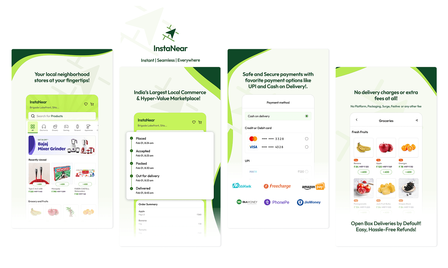
Overview
A quick-commerce product built to help local stores compete: two connected apps, one for shoppers buying from nearby kiranas, one for the owners running them. Live on the App Store and Play Store.
My Role
Started InstaNear and led its design end-to-end — research, both app flows, the design system, and hi-fi. Worked with a team of ~10 across product, engineering, and ops to take it from idea to two shipped apps.
Results
Shipped to the App Store and Play Store.
The Problem
The corner store can't out-deliver a 10-minute app.
So it shouldn't try to.
Quick-commerce giants are pulling everyday shopping away from local kirana stores — the same stores that already sit closer to the customer, already know the neighborhood, and already stock most of what people actually buy. They're losing on convenience and discovery, not on product.
Most "save the local store" ideas hand the owner a clunky dashboard and hope for the best. Owners don't have time for that — they're running a shop. So InstaNear had to work for two very different people at once: a shopper who wants Blinkit-level ease from a store down the lane, and an owner who needs to manage orders without it becoming a second job.
That two-sided constraint is the whole design problem, and it's why the product is two apps instead of one.
The goal wasn't to out-Blinkit Blinkit. It was to give local stores the same digital muscle without taking away what makes them irreplaceable.
Research Approach
Secondary research first.
Users to validate direction.
With a lean team and no existing user base to interview, we made a deliberate methodological choice: secondary research to form a strong hypothesis, then structured user validation before over-investing in the wrong direction.
This sequencing mattered. Building for local commerce is emotionally intuitive — it's easy to assume you understand the space because you've lived in it. Secondary research forced us to separate feeling from pattern.
What secondary research surfaced
Design Hypothesis
If we match the UX patterns users already know from Blinkit/Zepto, and layer differentiation into the value model rather than the interaction layer — we maximize adoption while still building something meaningfully different.
Consumer App
Familiar on the surface.
A different model underneath.
The consumer ordering experience was designed to feel immediately legible to anyone who'd used a quick-commerce app. Splash screen, phone login, browsable categories, search, product detail, cart, checkout. No learning curve, no onboarding tutorial required.
The UI language echoed what users already knew — category icons, product cards with MRP and selling price, add-to-cart affordances, order tracking with live status updates. This wasn't a lack of creative ambition; it was a deliberate choice to reduce the cost of switching.
Screen slot · Consumer — Onboarding
Primary Differentiator
Store-first discovery —
not product-first
Unlike quick-commerce apps where a pooled anonymous catalogue serves every order, InstaNear let users browse a curated list of nearby stores — their regular chemist, the electronics shop on the corner, the sweet shop they've visited for years — and order directly from a named vendor. The store had an identity. That was the point.
Pick your store
Intercity ordering
Schedule for later
Smart stock suggestions
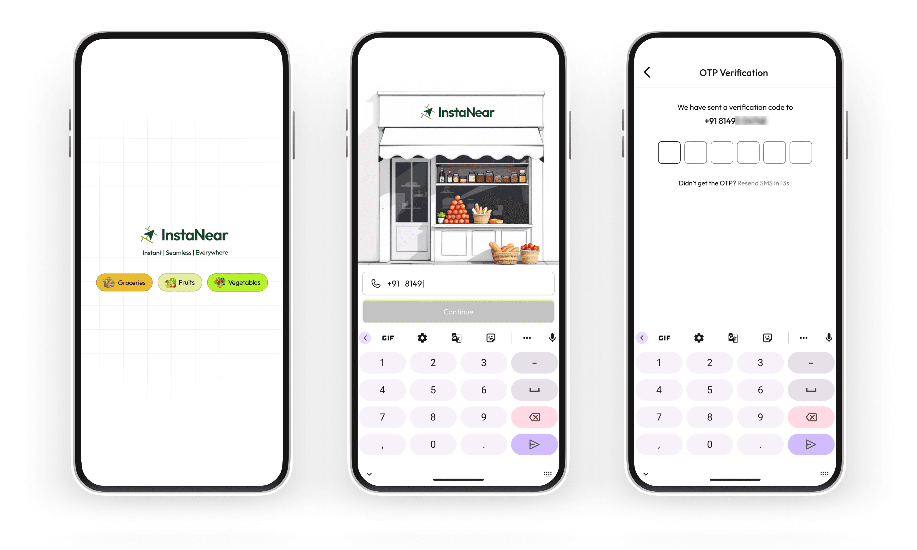
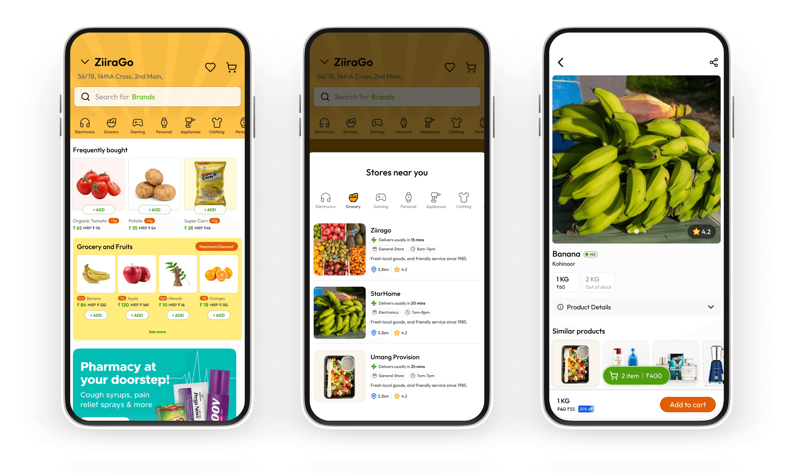
Consumer — Onboarding
Why store-first,
not pooled catalogue?
Intercity + scheduled delivery
A regional brand unavailable in the city, a traditional sweet for a festival, a part for an old appliance — ordered from anywhere, delivered on a schedule. No quick-commerce app served this.
Multi-store ordering
When users wanted items from different stores in one session, the app resolved it gracefully — cart management, delivery grouping, and transparent pricing all handled at checkout.
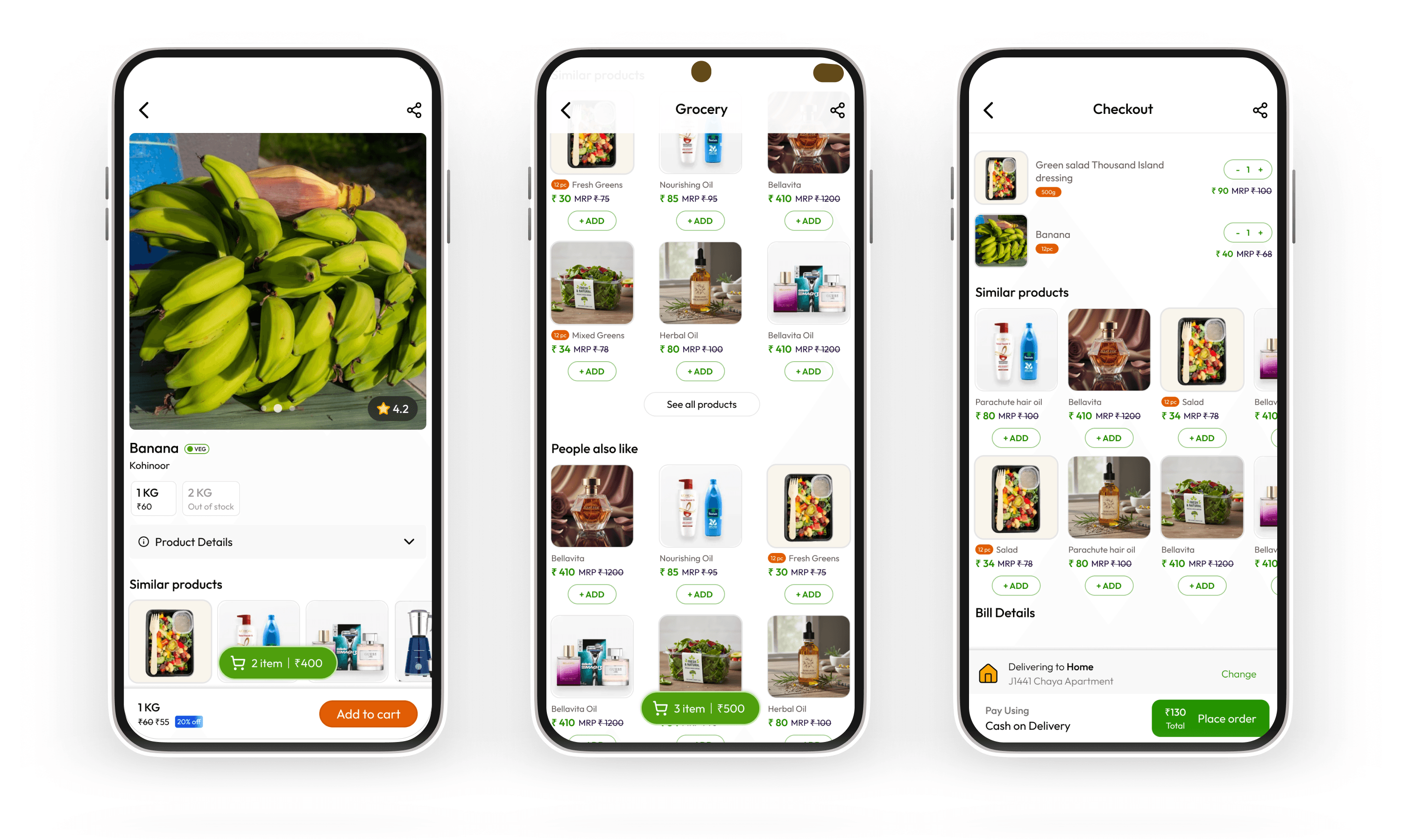
Consumer — Checkout
Smart Suggestion System
When a searched product wasn't available at the user's chosen store, the app surfaced nearby alternatives — other stores stocking the same item. This kept users in the session instead of bouncing, and fed directly into the vendor-side insight engine described in the next section.
Vendor App
Getting a kirana store online
without a tech team.
The vendor app was the harder design problem. The consumer experience had precedent — Blinkit, Zepto had shown the pattern. The vendor operations experience was largely uncharted, and the user was fundamentally different: a shopkeeper managing 500–2,000+ SKUs, often using pen and paper, with little patience for new software.
The design brief was clear: a store had to be able to go live in a single session. If onboarding took more than one sitting, it would fail in the field.
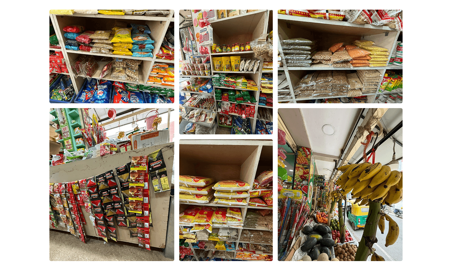
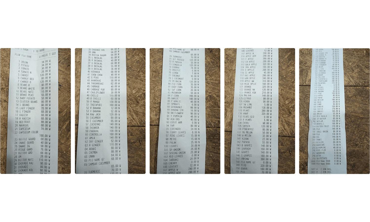
Vendor — Onboarding
Inventory onboarding — designed for the shopkeeper's reality
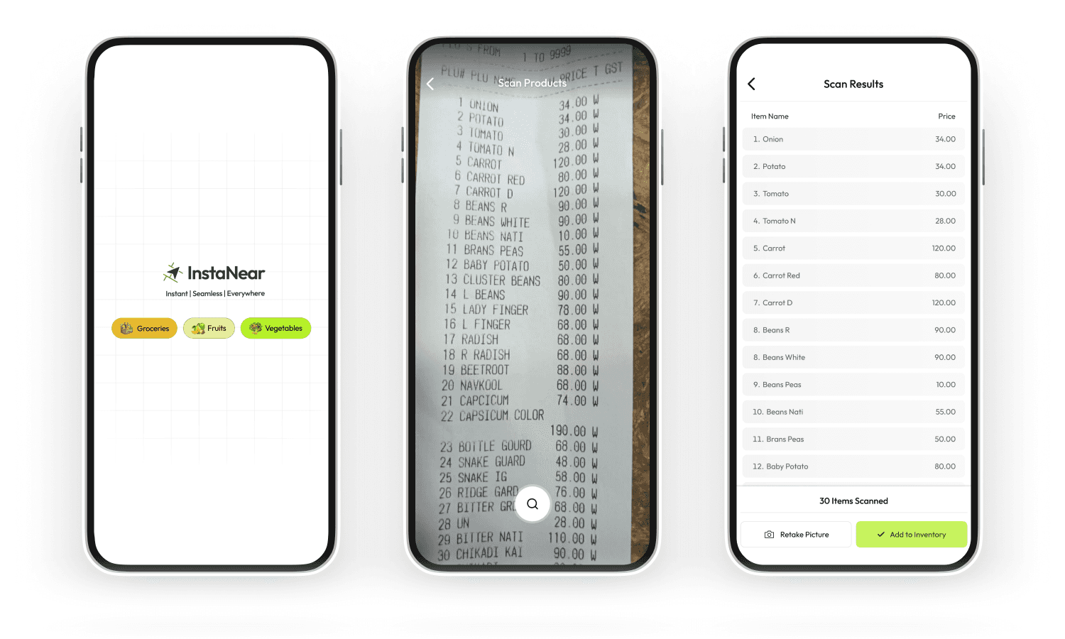
Vendor — Inventory
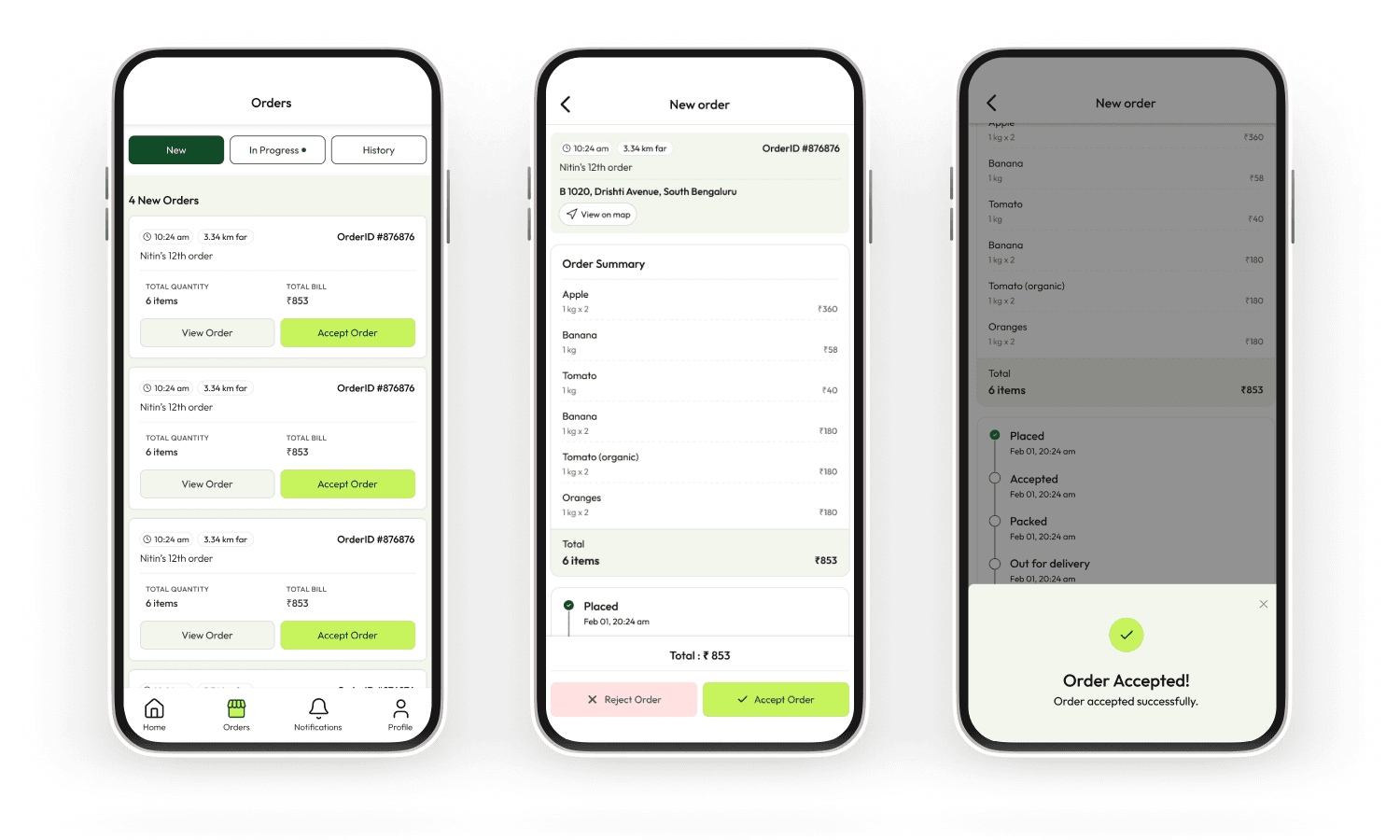
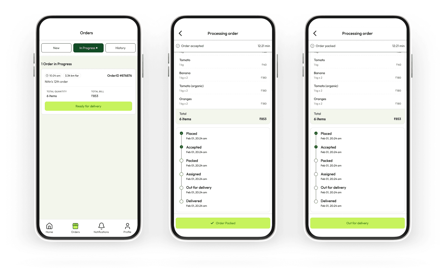
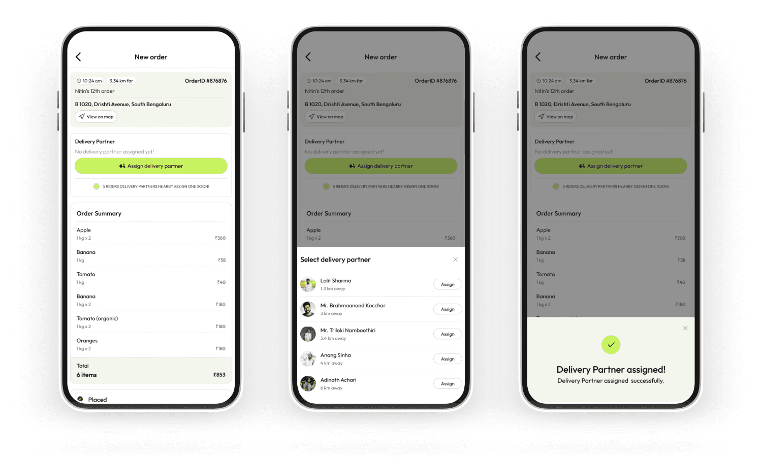
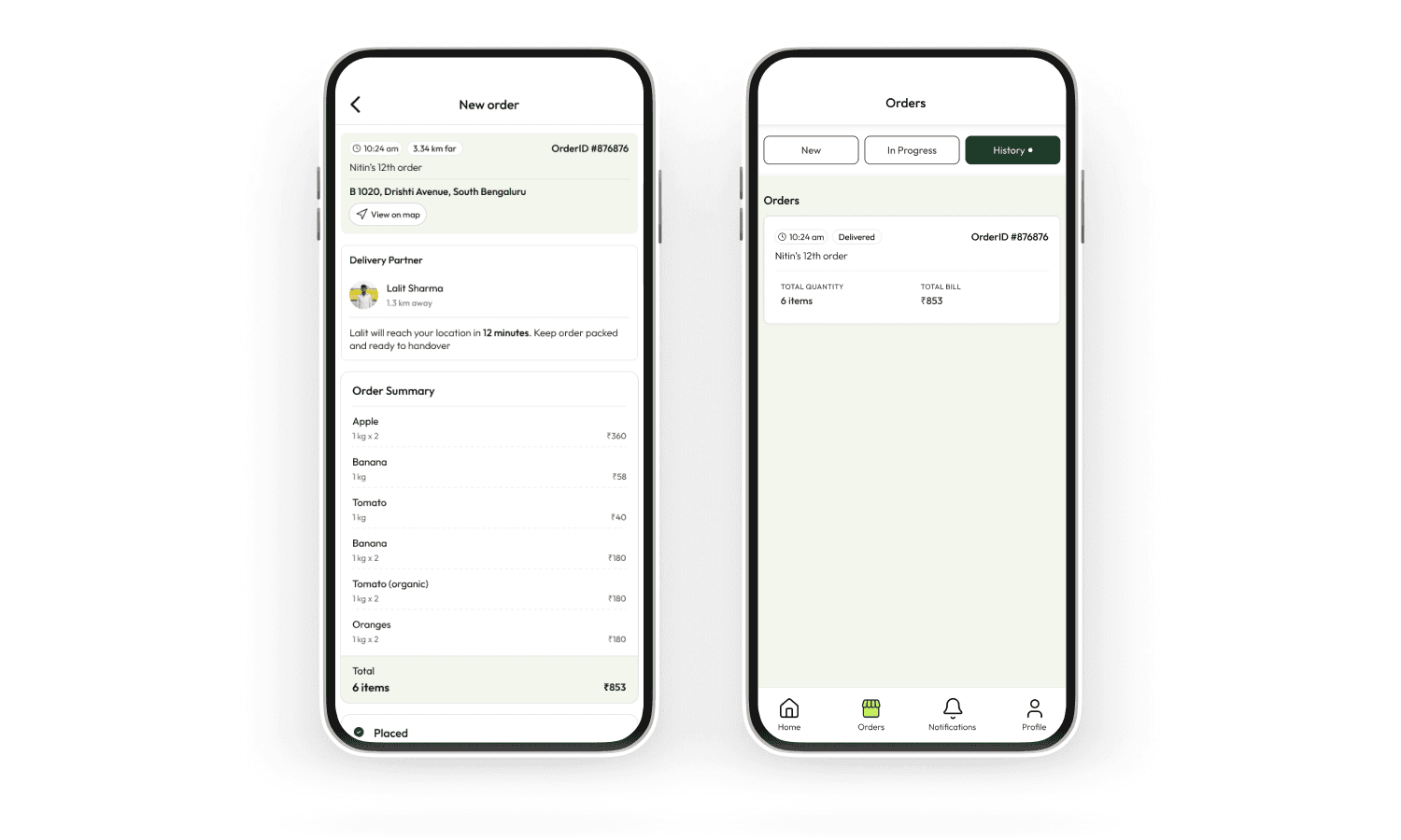
The full delivery loop —
one app, zero context-switching
STEp 1
Order receiving
Notification, item breakdown, customer details
Step 2
Accept & pack
Vendor confirms, marks ready for pickup
STEp 3
Partner assigned
Delivery API auto-assigns nearest rider
STEp 4
Live tracking
Shipment tracked end-to-end in app
Step 5
Payment settled
UPI or COD, visible in earnings
Order Management
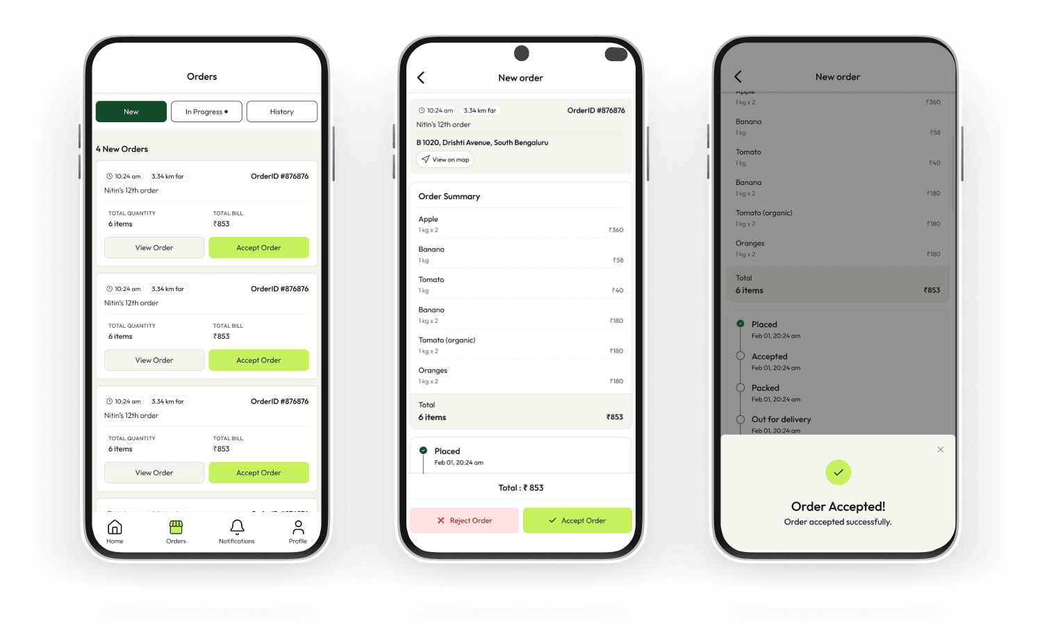
Standout Feature — Smart Vendor Nudges
Every time a customer searched for a product a store didn't carry, the system logged the miss. Vendors received aggregated weekly nudges: "14 customers searched for Maggi Masala-e-Magic near you this week — consider stocking it." This turned an operational failure state into a growth signal. It wasn't in the original brief — it emerged from thinking hard about what happens when the app can't help a user.
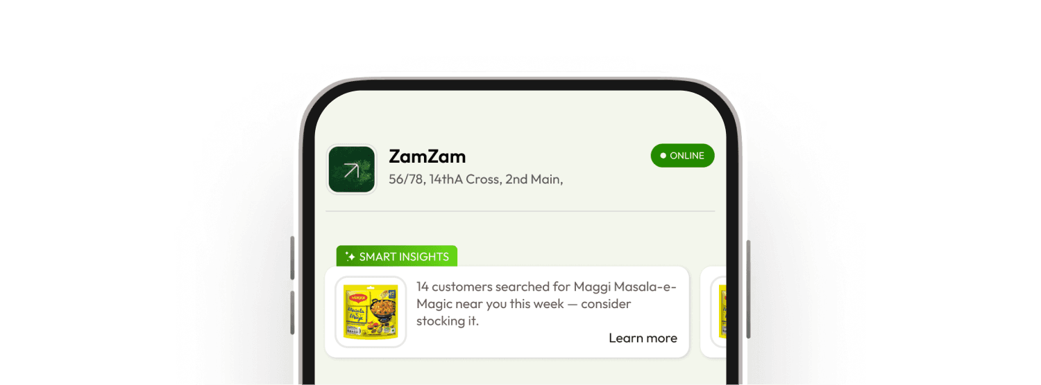
Vendor — Smart Insights
Outcome
2 Apps designed end-to-end from research to hi-fi
1 Core differentiator, clearly scoped and executed
Design Gaps & Reflections
What V1 didn't fully answer —
and should have.
V1 was a strong first cut, but a few gaps stood out in hindsight. The store-picker lacked trust signals — no ratings, reviews, or popularity cues to help new users choose confidently. Cart edge cases like out-of-stock items mid-checkout and multi-store sessions needed explicit design resolution, not just engineering fixes. On the vendor side, the OCR error-correction experience needed more care — a misread product name shouldn't feel like a broken form. We also shipped without a meaningful analytics layer for vendors, and without a shared design system, which led to inconsistencies across both apps in error, empty, and loading states. Accessibility wasn't formally audited either — a real gap given the diverse vendor user base.