A Reskin Is Not a Small Thing

EV Experience

Overview

The companion app for Matter's electric motorcycles. It's how riders check range, charging, ride data, and diagnostics, and how internal teams manage the fleet

My Role

Led the V2 visual overhaul of Matterverse — Matter's EV companion app — rebuilding the look against a new brand book. Owner controls held flow-for-flow; key Experience screens reworked outright.

Platform

iOS and Android.

Two mandates, not one

The job came with a split brief.


On Controls the rule was strict and underlined: change how it looks and feels, don't touch how it works — same screens, same flows, same taps. The new brand had to land entirely through the skin: type, color, grid, components, density, motion.


Experience was the opposite mandate — there I reworked key screens outright, not just their skin, where the old flow wasn't earning the test ride.


People file "reskin" under low-stakes design. I'd argue the opposite. When you can re-architect, a weak screen gets rescued by changing what it does. In a reskin you can only change how it feels — and feel is most of whether someone trusts a product, stays in it, and opens it again tomorrow. Remove the ability to fix things structurally and what's left is a pure test of visual judgment.

I was already the right person for it: I'd joined Matterverse making the iOS and Android builds match the designs — months in the gap where spacing drifts, fonts fall back, and the two platforms quietly disagree. By V2 I knew every surface, including the empty states and edge cases that never make a deck. Those are exactly where a reskin falls apart.

The job came with a split brief.


On Controls the rule was strict and underlined: change how it looks and feels, don't touch how it works — same screens, same flows, same taps. The new brand had to land entirely through the skin: type, color, grid, components, density, motion.


Experience was the opposite mandate — there I reworked key screens outright, not just their skin, where the old flow wasn't earning the test ride.


People file "reskin" under low-stakes design. I'd argue the opposite. When you can re-architect, a weak screen gets rescued by changing what it does. In a reskin you can only change how it feels — and feel is most of whether someone trusts a product, stays in it, and opens it again tomorrow. Remove the ability to fix things structurally and what's left is a pure test of visual judgment.

I was already the right person for it: I'd joined Matterverse making the iOS and Android builds match the designs — months in the gap where spacing drifts, fonts fall back, and the two platforms quietly disagree. By V2 I knew every surface, including the empty states and edge cases that never make a deck. Those are exactly where a reskin falls apart.

Two products wearing one app

My Matter

My Matter

My Matter

Experience

Experience

Experience


  1. The job is reassurance — my bike is fine, fast and legible.

  2. Experience is for prospects who direct-download: test rides, bookings, community.


Same brand, two emotional registers. Most of the interesting decisions came from holding both inside one visual system.

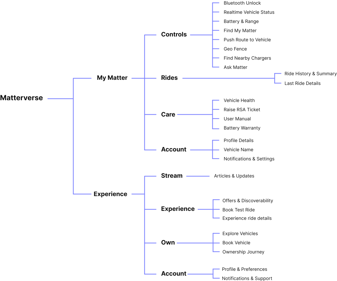
Matterverse companions the Matter AERA, India's first geared electric motorcycle. It runs on two spaces with opposite jobs. My Matter is for owners (phone tied to the vehicle): live data, controls, rides, care.


  1. The job is reassurance — my bike is fine, fast and legible.

  2. Experience is for prospects who direct-download: test rides, bookings, community.

Same brand, two emotional registers. Most of the interesting decisions came from holding both inside one visual system.

The work

I ran it through my usual loop


Discover → Define → Design → Develop → Validate

(bent for a reskin)


Discover was an audit, not research from zero: every place the old skin fought the new brand book.


Define set the hard scope and one decision that shaped everything


Designed a real component system, not restyle screens one at a time, so two platforms and hundreds of screens stayed identical and the build wouldn't drift.


Develop & Validate ran tight against engineering, checking live builds on both platforms in the boring states as much as the beautiful ones.

I ran it through my usual loop —


Discover → Define → Design → Develop → Validate — bent for a reskin.

Discover was an audit, not research from zero: every place the old skin fought the new brand book. Define set the hard scope and one decision that shaped everything — build a real component system, not restyle screens one at a time, so two platforms and hundreds of screens stayed identical and the build wouldn't drift. Develop & Validate ran tight against engineering, checking live builds on both platforms in the boring states as much as the beautiful ones.

Own & Experience

IMAGE — Own / Experience / Stream · The three immersive modules, full-bleed, with a callout on one signature motion moment.

IMAGE — Own / Experience / Stream · The three immersive modules, full-bleed, with a callout on one signature motion moment.

Most of the app was translation. Three modules were authorship. Own, Experience and Stream are the immersive surfaces — the most brand weight, the most engagement — and where I went deepest and led. Here the work stopped being "match the brand book" and became "decide what this moment should feel like": which render, which transition, how much the screen breathes. The flows stayed fixed; I owned the feel, and the interaction and motion that make a screen feel alive rather than printed.

Most of the app was translation. Three modules were authorship. Own, Experience and Stream are the immersive surfaces — the most brand weight, the most engagement — and where I went deepest and led. Here the work stopped being "match the brand book" and became "decide what this moment should feel like": which render, which transition, how much the screen breathes. The flows stayed fixed; I owned the feel, and the interaction and motion that make a screen feel alive rather than printed.

Decisions I'd defend

  1. One system, two platforms, zero drift. Components over screens — how V2 stayed identical across iOS and Android without policing every screen by hand.

  2. Density is a brand decision. My Matter runs tighter and calmer; Experience gets more air and more spectacle. Same system, dialed differently.

  3. Motion is connective tissue, not garnish. Transitions were specced as part of the visual system from the start, so the feel survived handoff instead of dying in the build.

IMAGE · A 3–4 frame still sequence of one signature transition.


Translating Telemetry into Meaning

One of the biggest design challenges was simplifying technical vehicle data into something emotionally understandable.

Rather than overwhelming riders with dense telemetry, the experience focused on meaningful ownership insights — ride efficiency, charging behavior, ride history, and battery patterns that could be understood at a glance.

The objective wasn’t maximum information density. It was clarity.

This balance became especially important because riders often interacted with the app in low-attention environments: outdoors, during transit stops, or while multitasking. The interface needed to feel lightweight and instantly readable.

Motion, Feedback & Interaction Design

Motion played a functional role throughout the product.

Animations and micro-interactions weren’t treated as decoration — they became part of the communication layer. Subtle transitions, haptic feedback, and responsive state changes helped reduce perceived latency and reinforce user confidence during remote interactions.

This became especially important during:-

  • Charging state transitions

  • Remote lock/unlock

  • Syncing states

  • Route transfers

Some motion systems were ultimately not shipped, but they strongly shaped the interaction language and emotional tone of the experience.

Systems & Collaboration

Systems & Collaboration

Systems & Collaboration

As the product matured, consistency became critical. Connected experiences already introduce uncertainty — the interface itself couldn’t feel inconsistent on top of that.

I helped define reusable interaction patterns and scalable UI foundations across telemetry cards, action states, status indicators, bottom sheets, and navigation systems.

The project also required close collaboration with engineering teams due to backend limitations, connectivity edge cases, and asynchronous system behavior. Many interaction decisions were shaped directly around real-world technical constraints rather than idealized product flows.

Outcome

MatterVerse shipped publicly across Android and iOS, establishing the UX foundation for Matter’s connected ownership ecosystem.

The project improved engagement across ownership flows during testing while reducing ambiguity around remote system states through clearer feedback patterns and interaction design.

More importantly, it reframed the role of the companion app itself — from a vehicle utility into an experience centered around confidence and ownership.

Usability Testing

Moderated task-based usability testing conducted with 28 participants to evaluate discoverability, navigation clarity, and task completion efficiency across core Matter Companion app flows.

Participants were given scenario-based tasks simulating real-world usage (vehicle control, service booking, support, and personalization) and observed for:


  • Task completion rate

  • Navigation hesitation

  • Error points

  • Decision-making patterns


Tasks Tested

19 critical product journeys across:

  • Controls — range, find my bike

  • Matter Care — service history, booking, maintenance, payments

  • Navigation — charging points

  • Support — SOS, troubleshooting, emergency settings

  • Personalization — speed presets, saved locations

  • Menu / System — notifications, bug reporting

Success / Failure Analysis

High Success Tasks
(90–100% completion)

  • Range visibility

  • Service booking

  • Modify service booking

  • Find my bike

  • Ride history

Reason: These flows had strong information hierarchy and clear entry points.

Moderate Friction Tasks
(75–89% completion)

  • Charging point discovery

  • SOS setup

  • Notification access

  • Save preset flow

Reason: Minor label ambiguity and deeper navigation layers increased search time.

High Failure Tasks
(<75% completion)

  • Previous service details

  • Final payment flow

Reason: Poor discoverability, unclear categorization, and insufficient action visibility.

Moderated task-based usability testing conducted with 28 participants to evaluate discoverability, navigation clarity, and task completion efficiency across core Matter Companion app flows.

Participants were given scenario-based tasks simulating real-world usage (vehicle control, service booking, support, and personalization) and observed for:


  • Task completion rate

  • Navigation hesitation

  • Error points

  • Decision-making patterns


Tasks Tested

19 critical product journeys across:

  • Controls — range, find my bike

  • Matter Care — service history, booking, maintenance, payments

  • Navigation — charging points

  • Support — SOS, troubleshooting, emergency settings

  • Personalization — speed presets, saved locations

  • Menu / System — notifications, bug reporting

Success / Failure Analysis

High Success Tasks
(90–100% completion)

  • Range visibility

  • Service booking

  • Modify service booking

  • Find my bike

  • Ride history

Reason: These flows had strong information hierarchy and clear entry points.

Moderate Friction Tasks
(75–89% completion)

  • Charging point discovery

  • SOS setup

  • Notification access

  • Save preset flow

Reason: Minor label ambiguity and deeper navigation layers increased search time.

High Failure Tasks
(<75% completion)

  • Previous service details

  • Final payment flow

Reason: Poor discoverability, unclear categorization, and insufficient action visibility.

Key Insights

1. Core utility flows are intuitive
Primary vehicle interaction tasks were completed quickly with minimal hesitation.

2. Service ecosystem needs stronger information architecture
Maintenance and service-related tasks were harder to locate.

3. Navigation labels need clearer mental mapping
Overlap between Care, Support, and Menu caused decision friction.

4. Critical transactional actions lack visibility
Final payment and historical service access need stronger visual priority.

+18% Experience flow engagement
+25% perceived product quality
Visual direction scaled across multiple surfaces
Select this text to see the highlight effect